
Pantone Color of the Year 2025: Incorporating It Into Your Toronto Wedding
Share
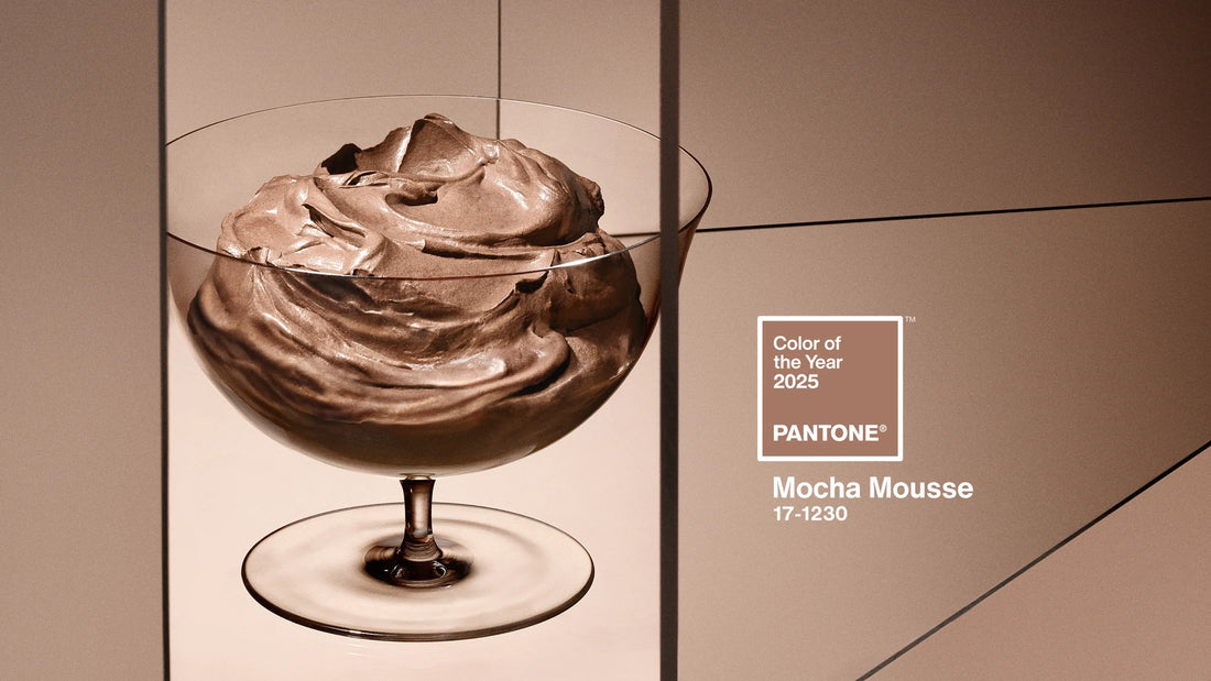
Each year, the Pantone Color Institute announces its Color of the Year, setting trends across industries from fashion to home decor and, of course, weddings. For 2025, Pantone has unveiled PANTONE 17-1230 Mocha Mousse, a warming, brown hue imbued with richness. It nurtures us with its suggestion of the delectable qualities of chocolate and coffee, answering our desire for comfort. If you’re planning your wedding in Toronto, this trendsetting color offers endless possibilities to infuse personality and style into your celebration. Let’s explore what Pantone’s Color of the Year is all about, why it’s relevant to weddings, and how you can incorporate it into your special day.
What is Pantone and the Color of the Year?
Pantone is a global authority on color, known for its standardized color matching system used across various industries. Each year, the Pantone Color Institute selects a Color of the Year that reflects global cultural trends and aspirations. This choice often inspires designers, artists, and event planners, becoming a go-to shade for the year’s creative projects.
For couples tying the knot, this color serves as a guide to creating an on-trend yet timeless wedding aesthetic, whether it’s in decor, attire, or floral arrangements.
Why the Color of the Year Matters to Weddings
Wedding trends are constantly evolving, and Pantone’s Color of the Year often influences everything from bridesmaid dress selections to table settings. By incorporating this hue, your wedding will feel fresh and modern while still allowing you to personalize the details. Plus, using a trending color ensures that your wedding photos will capture a sense of the year’s style and spirit.
How to Incorporate the 2025 Color of the Year Into Your Wedding
-
Floral Arrangements: Work with your florist to highlight the Color of the Year in your bouquet, centerpieces, and ceremony decor. Complementary or contrasting colors can be added for depth and visual interest.
-
Wedding Attire: Bridesmaid dresses, groomsmen’s accessories, or even the lining of a suit can reflect the year’s signature hue. If you’re daring, consider incorporating it into your own attire, such as shoes or a sash.
-
Stationery: Invitations, programs, and place cards are an excellent place to weave in the color. Use subtle accents or bold designs to tie everything together.
-
Decor: From table linens to lighting, there are countless ways to feature the Color of the Year in your reception. Opt for a statement piece, like a vibrant backdrop or a lounge area, to make a big impact.
-
Desserts: Talk to your baker about using the color in your cake design or dessert table. Ombre frosting, colored macarons, or custom sugar cookies can all showcase the shade.
Questions Couples May Have About Using the Color of the Year
-
Does it have to dominate the wedding palette? No! You can use the Color of the Year as an accent or highlight within a broader palette that suits your theme.
-
What if the color doesn’t match my venue? Work with your planner to incorporate the color in smaller details that won’t clash, such as napkins or florals.
-
Will it feel dated in a few years? While trends evolve, the key is to balance trendy elements with classic choices that stand the test of time.
Why Toronto Weddings Are Perfect for This Trend
Toronto offers a vibrant and diverse wedding scene, with venues ranging from urban rooftops to lush gardens. The Color of the Year can enhance any setting, from the contemporary elegance of downtown lofts to the romantic charm of heritage sites.
Here are some Toronto venues that could beautifully enhance the rich warmth of PANTONE 17-1230 Mocha Mousse:
-
Graydon Hall Manor: This historic estate's classic architecture and lush gardens provide a stunning canvas for incorporating earthy tones and cozy, rich decor.
-
The Fermenting Cellar: Located in the Distillery District, this industrial-chic venue pairs perfectly with the grounding nature of Mocha Mousse, especially when paired with warm lighting and rustic accents.
-
Evergreen Brick Works: With its blend of natural and urban elements, this venue allows for creative decor options that complement the comforting and versatile qualities of the color.
-
The Arlington Estate: Known for its luxurious and customizable spaces, it offers an elegant backdrop for bringing out the richness of the hue in a refined setting.
-
The Globe and Mail Centre: Featuring panoramic city views, this modern venue can incorporate Mocha Mousse in contemporary decor details, such as sleek table settings and lush florals.
-
Casa Loma: This iconic Toronto castle exudes timeless romance, making it a wonderful setting for showcasing the color in a dramatic, storybook style.
Additionally, Toronto’s local vendors and creatives are adept at integrating trends while respecting your unique vision.
Conclusion
Pantone’s Color of the Year 2025 is more than just a trend; it’s an opportunity to tell your love story through a modern and cohesive aesthetic. Whether you go bold or subtle, incorporating this hue into your Toronto wedding ensures a celebration that feels fresh, stylish, and unforgettable. Ready to bring your vision to life? At Poppin’ Petals, we’re experts at weaving color trends into custom floral and wedding designs. Let’s create something truly magical together!